Good UI UX design principles remain fundamental, but with technological advances, designers can now incorporate new features in software and services. As users’ expectations and preferences evolve, they experience what’s new and possible with tech capabilities. A well-designed UI has the potential to increase your website’s conversion rate by up to 200%, and a better UX design could yield conversion rates up to 400%, according to Forbes. Simply put, the numbers speak for themselves.
To stay ahead, tech developers need to pay close attention to trends in design, and what today’s users value. Here are 11 rising UX design trends that new products should have, from contextual personalization and 3D designs to voice search serving all users better. These trends give a glimpse of the future of websites, applications, and software.
Looking ahead to the future of UX design, one prominent trend takes center stage: personalization. Consumers today are more discerning than ever before, and they demand experiences that are tailored to their unique preferences and needs.
A one-size-fits-all approach is no longer sufficient. To succeed, products and services must be customized for each user. This shift towards personalization has opened up exciting new opportunities. Content can now be created in a way that directly resonates with users’ interests, providing an immersive and engaging experience. Shopping experiences can now be designed to emulate a personal concierge, guiding users towards products that align with their unique tastes. Interfaces can also be tailored to individual needs, simplifying navigation through complex systems. The benefits of personalization are evident, with research indicating that brands that tailor their offerings to individual users are more effective at retaining customers.
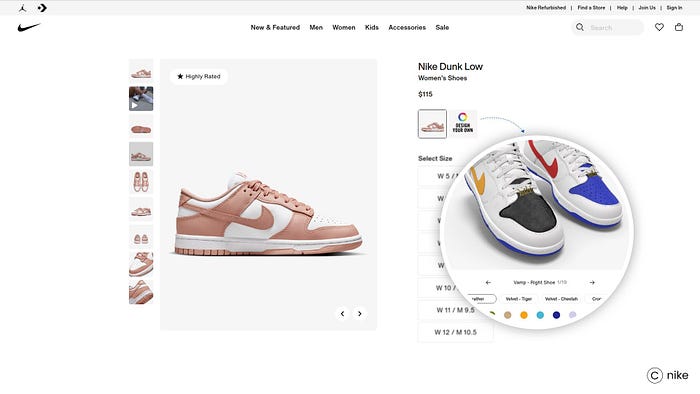
A staggering 88% of consumers consider personalization essential in today’s marketplace. With ongoing advancements in AI and automation, we can expect even more sophisticated personalization strategies in the years to come.
Platforms like Netflix, Instagram, and Shopify are already offering curated recommendations, shopping suggestions, and pre-made playlists, and the trend of tailoring user experiences has intensified. Personalization not only benefits businesses, especially in eCommerce, by enabling data-driven targeting of potential customers, but it also enhances the user experience. Users enjoy a more convenient online experience, receiving the information they desire without explicit requests. UX designers now focus on curating meaningful experiences rather than just improving customer satisfaction. As technology continues to advance, the UX community must establish stronger boundaries and ethical approaches to ensure a holistic encounter with users.
The use of 3D animation has become increasingly popular on websites in the past year. It enhances the user experience by adding excitement and surprise to website interfaces. More websites are now incorporating animations, videos, and 3D objects to create a distinctive user engagement.
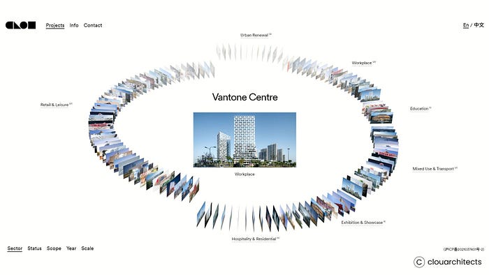
3D design brings a sense of beauty and elegance to objects showcased on websites, making it easier for businesses to capture potential consumers’ attention. It also allows businesses to showcase their products’ real-world applications by providing comprehensive, 360-degree information. The use of 3D animation designs has proven to be effective in prompting users to explore further websites. As a result, 3D animation has become an essential component for businesses that want to stay current and engaging in the digital landscape.
Although 3D design is not new, there is an anticipated resurgence and evolution of the UX design trend in 2024. The accessibility of new-generation 3D tools is making it easier for amateur and professional designers to create immersive experiences. The prevalence of 3D content in web design and app creation is evidence of this shift, and modern UX design tools like those introduced by Adobe Illustrator streamline the once cumbersome process.
Micro-interactions are small visual movements that have a significant impact on UX design. They include actions such as swiping, hovering, animations, and data input, and they make the user experience more engaging, interesting, and enjoyable.

The trend of using micro-interactions in UX design started a few years ago. It was initiated by Google, which made buttons enlarge when users clicked on them. Since then, micro-interactions have become a buzzword in the design industry. In 2024, they are predicted to become a standard in both mobile and desktop UX design. Designers now understand that static elements give an out-of-date vibe, so providing feedback and transitioning the design game from static to dynamic is important.
In the Wix Editor, for example, users need feedback from icons as they build a website. Small animations and color changes provide users with the feeling that elements communicate with them.
Micro-interactions are subtle yet essential elements of UI/UX design that can significantly impact the user experience. Experienced designers will focus on crafting meaningful micro-interactions that offer instant feedback, guide users through tasks, and add delight to the user journey. These small design elements can make a big difference in user satisfaction.
Have you noticed a recent darkening of your screen? You’re not alone in this experience, as the popularity of dark mode design is on the rise across operating systems, apps, and browsers. Apple, for example, has incorporated a dark mode in both its iOS and MacOS operating systems. However, creating an effective dark-mode website involves more than simply selecting a black background color. What works for one design might not work for another, making it crucial to seek expert UX design services if you’re uncertain about your dark mode selection.
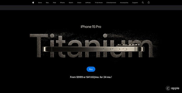
If you’re aiming to establish a brand with a dramatic, mysterious, or sophisticated impression, take a cue from Netflix. The majority of Netflix customers engage with content in dimly lit environments or at night, leading the platform to implement dark mode in their websites and apps. Netflix recognizes the importance of providing a seamless experience that considers users streaming in low-light scenarios. The darker user interface not only recreates the cinematic sensation of a theater but also enhances the viewing experience in such environments. When implementing dark mode on your website, consider the duration users spend scrolling or interacting with your content.
In essence, Dark Mode is a feature gaining traction, claiming benefits like increased visibility, improved focus, and reduced eye strain. Regardless of the claims, one thing is clear: Dark Mode is for everyone, and more websites are embracing this trend. Netflix uses dark mode to provide a seamless experience from the screen to the rest of the environment, recognizing that users will be streaming in this type of scenario. The darker UI on these streaming sites not only helps to recreate the cinematic sensation of being in a theater, but it is also easier for the eyes to watch the videos in the given environment.
Maintaining a clean user interface is a fundamental principle of UX design. However, when designing for audiences such as Gen Z, it’s beneficial to infuse a creative twist. Over the past few years, the prevailing trend in design has favored clean programs with generic, flat designs. Nevertheless, even in flat designs, we now observe the incorporation of small elements that stand out, according to industry experts. These subtle visual twists can positively impact minimalistic designs. For instance, the Pitch interface adopts a black-and-white scheme with flat icons, yet it introduces a surprisingly sophisticated gradient within the generic design. This exemplifies how unexpected visuals and behaviors can effectively capture user interest.

In recent years, there has been a surge in the popularity of retro themes, with nostalgic elements gaining traction in fashion, photography, and video. Websites employing older style images, fonts, colors, layouts, and typography are commonly referred to as “retro” or “vintage.” This design choice has gained favor due to its ability to evoke diverse emotions and resonate with site visitors. Web designers often leverage retro features to quickly grab the user’s attention, presenting products, advertising, and other content in an immersive style that encourages users to click on call-to-action buttons, ultimately converting visits into sales.
A gradient, often referred to as a “color progression” or “color ramp,” is a design element characterized by a smooth transition of colors blending into one another over time. Whether composed of various shades of a single color or a combination of multiple colors seamlessly merging, gradients are visually appealing on websites, capturing the attention of users and maintaining their engagement.

This design technique is a prominent trend in graphic design, making gradients one of the most popular choices. Their memorable and impactful nature allows them to convey a strong statement and elicit emotions from users, fostering a connection with a concept or product. When employed effectively, gradients can lend a trendy look to your website, leaving a lasting impression on visitors and significantly enhancing their overall experience.
Glassmorphism is a user interface design trend that leans toward light or black objects set against subdued, colorful backdrops. This design approach involves applying a backdrop-blur effect to the objects, creating a frosted glass effect that allows the background to shine through.
Major players in the tech industry, such as Apple with its macOS Big Sur update and Microsoft with its latest fluent design system, have fully embraced this stylish trend known as Glassmorphism.

Understanding user behavior is a critical aspect of user experience design — a nuanced yet essential factor. Numerous usability improvements hinge on comprehending how users perceive, think, and respond to a product. This insight into user behavior serves as the foundation for building effective products and designing experiments aimed at influencing behavioral change and fostering growth. Adopting an end-to-end approach to product development encourages teams to approach their customers from a usability perspective.
In the competitive landscape of today’s industry, companies have recognized the significance of delving into user behavior. The era of relying solely on calendar alerts and handwritten notes is long gone. Businesses now actively gather and analyze user data, providing valuable insights that enhance user experience and elevate product engagement.
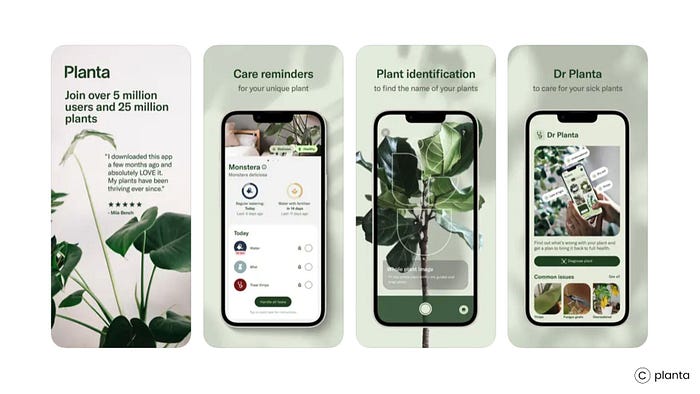
In the realm of consolidating navigation links into a single, user-friendly hub, businesses lean towards the Hamburger navigation menu. Renowned for its sleek, dynamic, and mobile-friendly design, this menu not only captures user attention but also boasts a stylish and realistic appeal.

Breadcrumbs play a crucial role in enhancing your site’s navigation and overall user experience. Serving as a secondary navigation menu, they significantly improve the discoverability of your landing pages. This is particularly valuable for users who arrive at your site through search, as breadcrumbs enable them to swiftly navigate to higher-level pages. Whether a visitor is on a product page or exploring a category page, breadcrumb navigation simplifies their understanding of the hierarchical relationship between different levels.
Not only does breadcrumb navigation facilitate a seamless browsing experience across various categories, but it also contributes to reducing the bounce rate on your website. This functionality offers users a visually stunning and user-friendly way to explore different sections of your site. There are various types of breadcrumb navigation, including attribute-based, hierarchy-based, and history-based options.
Furthermore, breadcrumbs play a pivotal role in improving SEO performance. This benefit extends beyond user experience to include search engine crawlers. These crawlers, akin to users, find it advantageous to have an easy way to navigate through a site. By following the breadcrumb trail, which establishes a defined path through a hierarchy of links, search engine robots can effectively track content across the web, ultimately enhancing the overall performance of your site in search engine results.
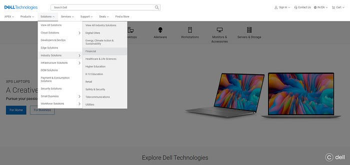
A call-to-action (CTA) button serves as a pivotal interactive feature on both web and mobile devices, aiming to encourage users to take specific actions that drive conversions for a particular page or screen, be it making a purchase, reaching out, or subscribing. Determining the optimal placement of CTAs on your website and identifying the appropriate situations for each type — Subscription CTA, Learn more CTA, Purchase CTA, Social sharing CTA, and Form CTA — holds significant weight in influencing conversions.
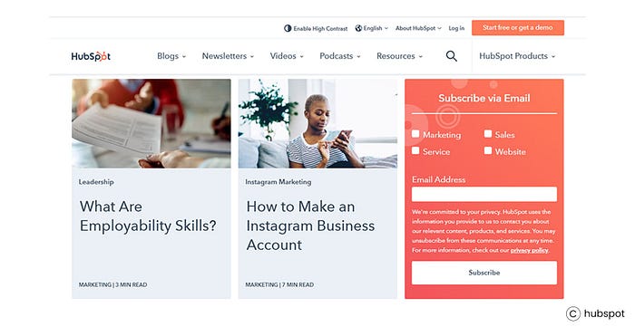
The Social sharing CTA plays a crucial role as it empowers visitors to share valuable and informative content on their social media platforms, effectively promoting your business and boosting user engagement. Additionally, offering a subscription option allows users to stay informed with the latest updates and industry best practices delivered directly to their inbox. Meanwhile, the Form CTA stands as an effective method for gathering customer information, which can be utilized for future promotional endeavors.

Once you’ve successfully attracted visitors to your website through the diverse CTAs mentioned, the next step is to guide them toward becoming customers. Purchase CTAs, in particular, play a pivotal role in initiating activities that nurture potential customers into making a purchase.
In summary, it’s imperative to be adaptable in our ever-evolving professional landscape. Staying well-versed in the industry, embracing new technologies, and staying abreast of the latest user experience data positions us for future success. What truly distinguishes exceptional UX designers is their capacity to empathize with users, crafting experiences that genuinely resonate with them. By comprehending user needs and preferences, we can create UX that not only functions effectively but also captivates and delights.
Let’s eagerly welcome the future of UX, committing ourselves to designing experiences that genuinely impact people’s lives. With dedication, creativity, and a profound commitment to our users, we can contribute to shaping the world of tomorrow, one pixel at a time. If you’re ready to embark on designing a compelling website, partner with us to develop a strategic web design plan and execution roadmap that elevates your brand presence and maximizes your business impact. Contact us today!
In case you have found a mistake in the text, please send a message to the author by selecting the mistake and pressing Ctrl-Enter.
#NextGen #User #Experiences #Glimpse #2024s #Design #Landscape


