Navigation is the backbone of a successful website. A well-designed navigation system guides users through content, enhances their experience, and helps them find what they’re looking for effortlessly. In this article, we’ll explore essential web design tips to enhance website navigation, ensuring a seamless and enjoyable user journey.
The Importance of Effective Website Navigation
Website navigation plays a pivotal role in user engagement and retention. A user-friendly navigation structure:
Increases the time users spend on your site, as they can easily explore different sections.
Improves conversions by guiding users towards calls to action (CTAs) and important content.
-
The content outlined below is represented on Crystaylor Creative’s website. Please view her website for visual representation on how to exactly implement these functionalities on your website as well!
Web Design Tips for Improved Navigation
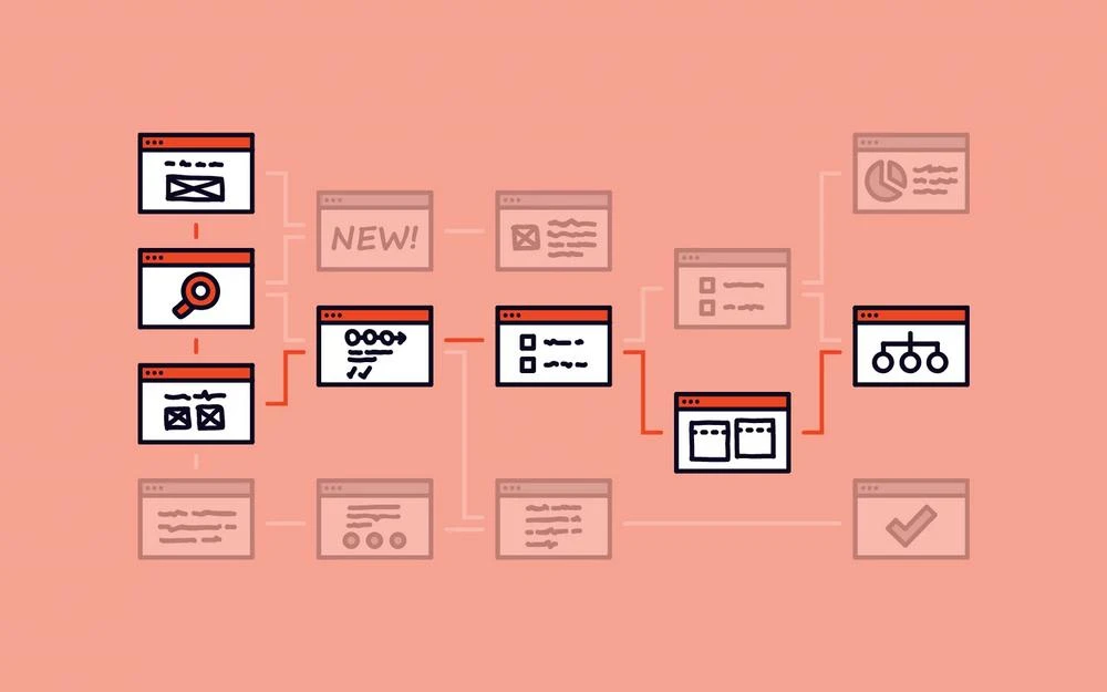
1. Keep it Simple: Prioritize simplicity in navigation. Use clear and concise labels for menu items and avoid overwhelming users with too many options.
2. Clear Hierarchy: Organize content in a logical hierarchy. Place the most important and frequently accessed pages prominently, and use submenus for secondary content.
3. Consistent Layout: Maintain a consistent navigation layout across all pages. Users should be able to predict where to find navigation elements without confusion.
4. Descriptive Labels: Use descriptive labels that accurately convey the content of each page. Users should understand the purpose of a link without clicking on it.
5. Visual Clarity: Make navigation elements visually distinct. Use contrasting colors, typography, or icons to highlight navigation menus and buttons.
6. Responsive Design: Ensure navigation remains user-friendly on various devices and screen sizes. Implement responsive design to adapt navigation layouts accordingly.
7. Mega Menus: For websites with extensive content, consider using mega menus to display a larger number of menu items in an organized manner.
8. Search Bar: Include a search bar to assist users in finding specific content quickly. Place it prominently and use an intuitive icon or label.

9. Breadcrumbs: Breadcrumbs provide users with a trail of their navigation path. They enhance user understanding of site structure and aid in backtracking.
10. Call-to-Action Placement: Integrate prominent CTAs within the navigation flow. Direct users to key actions such as signing up, making a purchase, or contacting you. If we view Crystaylor Creative’s website, we can see a prominent CTA on the top right of the webpage.
11. User Testing: Regularly conduct usability testing to identify navigation pain points and gather feedback from users. Use insights to refine your navigation strategy.
Real-Life Examples of Effective Navigation
Amazon: Amazon employs a combination of top-level navigation, dropdown menus, and a robust search bar to help users find products efficiently.

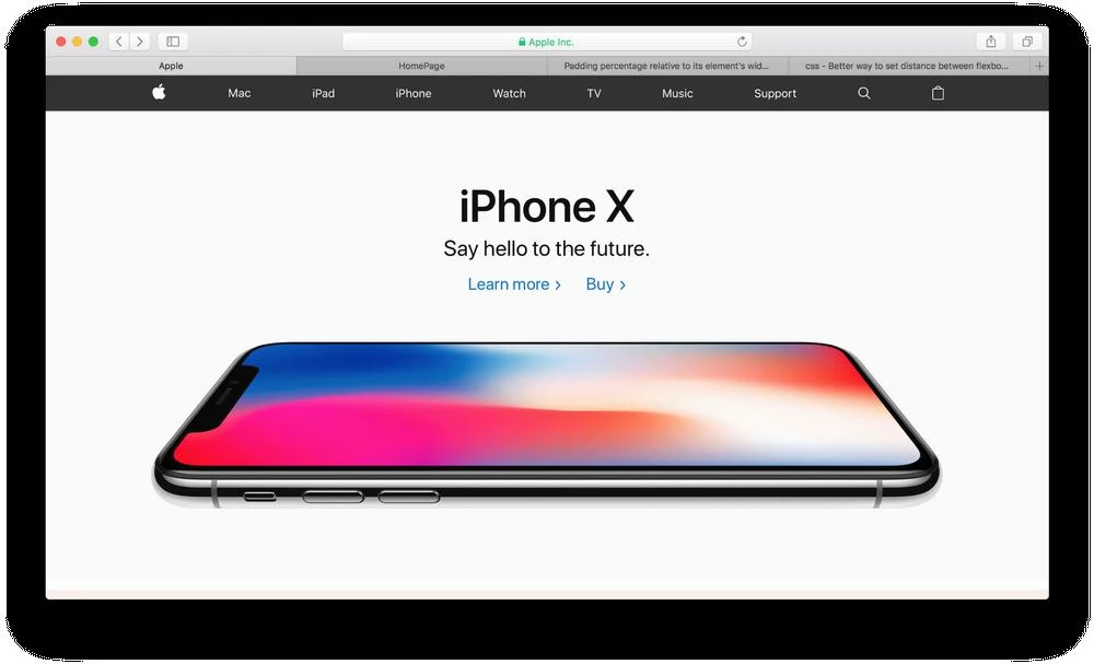
Apple: Apple’s minimalist navigation emphasizes product categories, making it easy for users to explore their range of products and services.
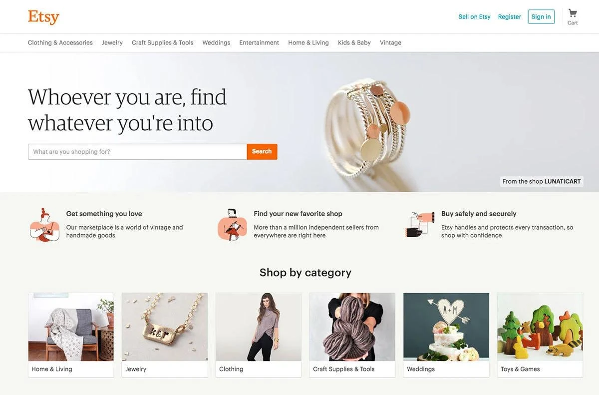
Etsy: Etsy uses a simple and clear navigation bar that showcases key sections while also offering a comprehensive dropdown menu for more options.
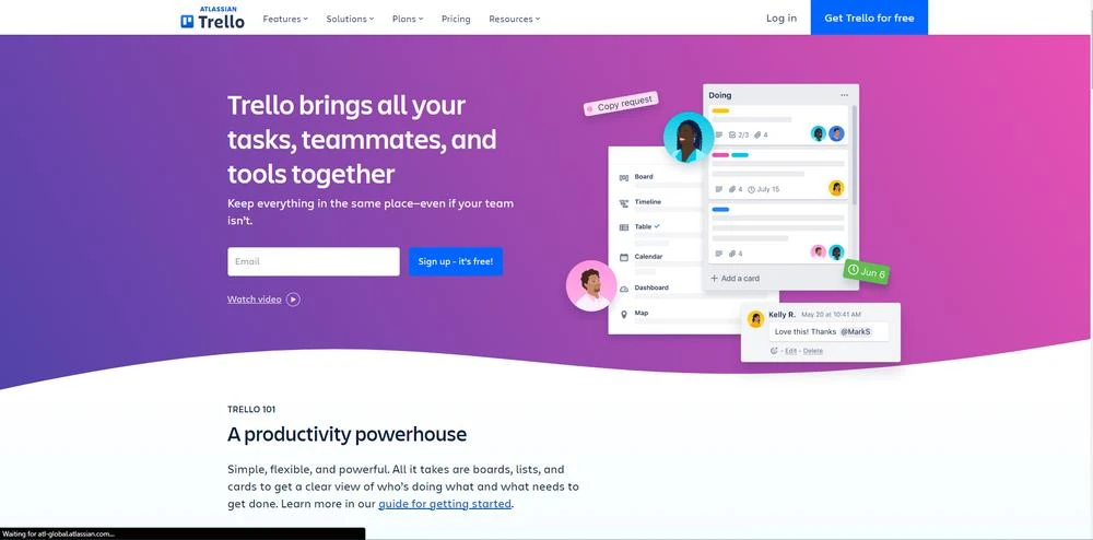
Trello: Trello’s navigation is centered around boards, providing a straightforward path for users to manage their projects and tasks.
Crystaylor Creative: Crystaylor Creative has a simple and clear navigation on the top of their page, along with a prominent CTA to “Schedule A Consultation” on the top right.

Effective website navigation is the cornerstone of a positive user experience. By implementing these web design tips, you can create a navigation system that guides users smoothly through your content, keeps them engaged, and facilitates their journey towards desired actions. Remember that website navigation is an ongoing process – regularly evaluate its effectiveness and make adjustments as your content and user needs evolve. A well-organized and intuitive navigation structure not only benefits your users but also contributes to the overall success of your website.
In case you have found a mistake in the text, please send a message to the author by selecting the mistake and pressing Ctrl-Enter.
#Web #Design #Tips #Improving #Website #Navigation


